Wondering if light floors match light walls, or do dark floors go well with bold wall colors? As an experienced interior designer, many clients have asked me how to match wall color with wood flooring. Use this guide to find the right wall and floor hues for stylish residential interiors.
How to Match Wall Color With Wood Flooring
When selecting wall colors for rooms with wood floors, aim to create a harmonious and clean-looking space. The goal is to achieve an aesthetically pleasing and balanced look. Here’s my take on choosing wall pigments that complement different wood floor tones:
Complementary Wall Colors for Light Wood Floors
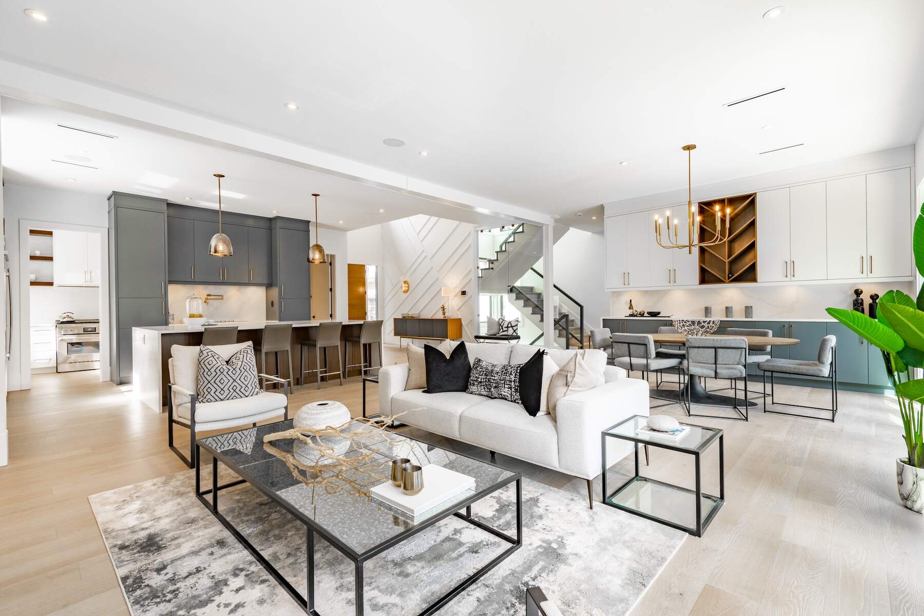
Light wood floors, like maple or light oak, make a space feel open and airy. They can make our spaces appear bigger than they are. Also, they work exceptionally well with various wall hues, including the following:
- Soft, Cool Hues: Shades like pale blue or soft green can create a serene and calming effect. They work well with the natural, light tones of the wood. Thus, they enhance the open, airy feel while sustaining a sophisticated appeal.
- Warm Neutrals: These are my go-to colors when I want to add warmth to the room. Sample shades include beige, light gray, or even a soft peach.
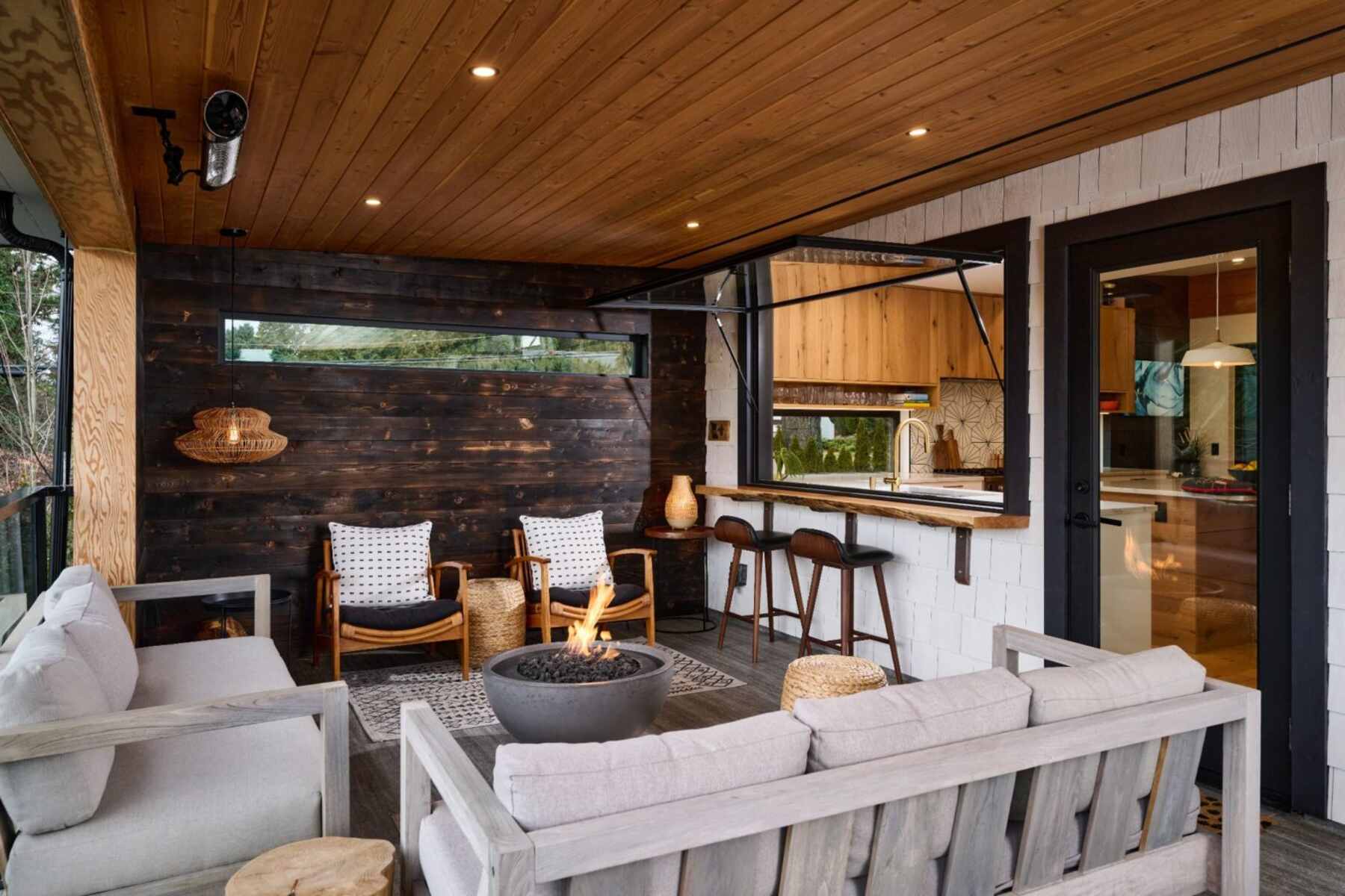
- Bold Contrast: Consider using dark hues like navy or charcoal to make a room look more dramatic. These shades create a striking contrast with light wood floors. Note that this approach works best in rooms with plenty of natural light.
Ideal Wall Colors for Medium Wood Floors
Medium wood floors, such as those in medium oak or cherry shades, have a warm, inviting quality. Here’s how to choose wall colors that complement these tones:
- Neutral and Earthy Tones: Shades like taupe, soft browns, and grays can create a harmonious look. They enhance the warmth of the wood without clashing.
- Soft Pastels: Light shades such as lavender, mint, or blush can subtly touch rooms with medium wood floors. These hues add a sense of sophistication to the space.
- Rich and Deep Pigments: Consider using deeper hues like burgundy or deep blue for a dramatic and luxurious vibe. These colors can bring out the richness of the wood.
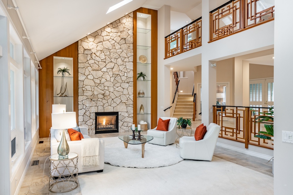
Best Paint Colors for Dark Wood Floors
Dark wood floors are timeless. They offer a rich and elegant backdrop for a variety of decor styles. When it comes to choosing wall paints for rooms with dark wood floors, the options are pretty diverse:
- Grays and Greiges: They give off a neutral base. Plus, they complement dark wood without being overwhelming.
- Light Blues: These hues provide a soothing and elegant look, perfect for a California Modern interior design. They also make a nice contrast that adds calmness.
- Darker Greens: They create a rich and cozy atmosphere for a dramatic effect.
- Warm Tan: The color compliments dark wood tones. Use this in well-lit rooms to enhance the wood’s richness and depth.
 Wall Colors That Enhance Cherry Hardwood Floors
Cherry hardwood floors are known for their rich red tones. The color pairs well with these wall color options:
- Cool White Hues: They offer a striking contrast against the rich red tones of cherry flooring. Also, they give off a visually appealing balance.
- Lighter Blue Tones: These hues provide a complementary and soothing contrast. They can enhance the warm reds in cherry wood floors.
- Cooler Grays: These hues subtly enhance the elegance of cherry floors. The best part is they don’t overpower the natural beauty of the wood.
- Soft, Cool Greens: They complement the red tones in cherry wood, adding a fresh and natural feel to the room.
- Rich Navy: This color highlights the floor’s elegance. It is ideal for a dramatic and regal look in spaces like dining rooms.
- Light Blue Wall Shades: These contrast nicely with red-toned floors. They add depth and dimension to the overall space.
Choosing Wall Colors for Gray and Golden Wood Floors
For rooms with gray wood flooring, like I typically do in West Coast Contemporary design, go for warmer leaning off-white or neutral wall hues. Paint colors like silky white and Swiss coffee can offset the colder vibes of gray floors. Avoid matching gray wall colors with gray floors, creating a monotonous look.
In contrast, golden oak or honeywood floors are best with white or cooler neutral shades. These hues will offset their yellow undertones. Stronger wall colors like navy or pigeon can modernize these warmer wood tones.
Try pairing them with neutral or white walls for a timeless and elegant ambiance in dark wood floors. True neutral whites are excellent choices. These shades bring out the depth and richness of dark wood floors.
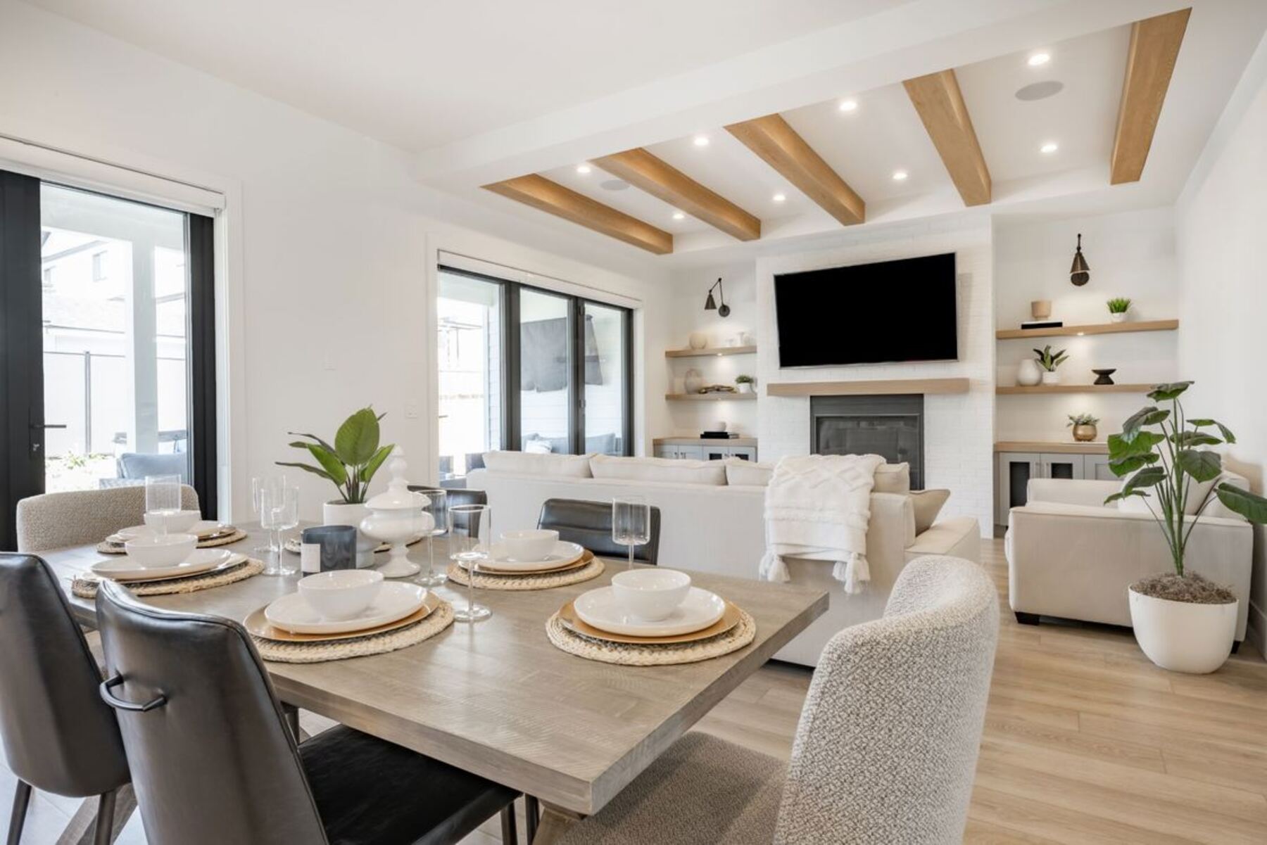
Harmonizing Floor and Wall Colors in Various Rooms
In my experience, it’s all about balancing aesthetics and functionality. For example, in my Organic Modern interior design projects, I’ve often used tranquil hues in bedrooms. These hues work to turn the room into a peaceful sanctuary.
In contrast, I lean towards warmer, more social pigments for living areas. These hues invite conversation and relaxation.
In kitchens, I love using colors that evoke freshness and vitality. I often draw inspiration from natural elements like herbs or citrus.
Creating a Cohesive Look Throughout the Home
We must focus on a consistent color flow to create a cohesive look throughout our homes. This doesn’t necessarily mean every room needs the same color. Instead, we want to create a harmonious color story.
For instance, using different shades and tints of a few colors can create a seamless transition from room to room. Consistency is also crucial with the trim and doors. Uniformly painting or staining them brings a sense of unity. 
Additionally, repeating patterns throughout our homes can establish cohesiveness. These include stripes or polka dots in various forms. Don’t forget about consistency in metallic finishes. To create harmony, use a consistent metallic theme for hardware, light fixtures, and other details.
Specific Room Considerations: Bedrooms, Living Rooms, and Kitchens
When it comes to specific rooms, the colors should align with their function. Here are some suggestions:
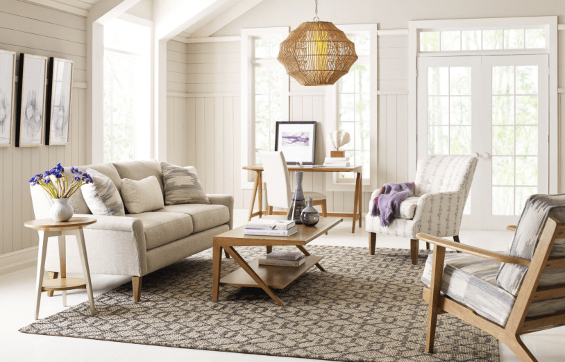
- Bedrooms: Soft blues, greens, and neutral tones are ideal. They create a serene environment conducive to rest.
- Workspaces/Home Offices: Vibrant blues, greens, or yellows can energize the space. These colors will also enhance focus and productivity.
- Living Rooms and Dining Areas: Choose warm, inviting hues to foster a welcoming and social atmosphere.
- Kitchens and Dining Rooms: Rich greens, vibrant yellows, or warm terracotta are recommended. They can stimulate appetite and enhance the dining experience.
- Bathrooms and Home Gyms: Choose refreshing colors in bathrooms. Use motivational tones in home gyms to suit their specific functions.
Experimenting With Color Contrasts and Combinations
In interior design, experimenting with color contrasts and combinations is captivating. It adds depth, character, and visual interest to spaces. Let me share some insights and practical approaches I’ve found helpful in my work.
Playing With Opposite Undertones for Visual Interest
To create visual intrigue in interior design, play with opposite undertones effectively. Think of pairing opposite colors on the color wheel, like blue with orange or purple with yellow.
This doesn’t mean we need to turn our room into a kaleidoscope of bright colors; it’s more about finding a balance. A deep navy wall can be offset beautifully with warm, mustard-yellow accents. We’re aiming for a space that feels dynamic and interesting without being overwhelming.
Balancing Light and Dark Shades for Room Dynamics
Balancing light and dark shades can dramatically alter the dynamics of a room. I’ve seen how dark colors make a room feel more intimate and grounded. Meanwhile, lighter tones, especially in a Contemporary Chalet interior design style, make it feel more open and airy.
For example, a dark wood floor room can be brightened with light, creamy walls. The combination will create a sense of balance. It’s not just about the colors themselves. Mainly, it’s more on how they interact with each other and the space as a whole.
Frequently Asked Questions
Do Scratches Show up More on Dark or Light Hardwood?
Scratches are more noticeable on dark hardwood floors than on light ones. This is because most wood floor species are naturally light in color. On light hardwood floors, the less contrasting scratches are not as pronounced.
What Color Flooring Goes With Everything?
When it comes to versatility, light hardwood floors are a popular choice. They can adapt to various color schemes and design aesthetics. However, it’s always important to consider our personal style and the specific features of our space when choosing a floor color.
What is the Ideal Color for Stair Spindles?
When deciding the ideal color for stair spindles, consider the homes’ overall style and color scheme. Neutral tones like white and beige are versatile, lending a light and airy feel. White spindles are a popular choice, seamlessly blending with various interior styles.
Conclusion
This article must have helped in learning how to match wall color with wood flooring. Each room achieves a tailored, cohesive look. We can do it by selecting wall colors that compliment wood floor tones, from light woods to rich darks. It’s about blending aesthetics with functionality for stylish, welcoming spaces.